Boost Your SaaS Conversions with Clear Messaging

Many SaaS companies invest heavily in paid ads, SEO, and outbound outreach to bring traffic to their websites. But if that traffic doesn't convert into sign-ups, demos, or sales, growth stalls.
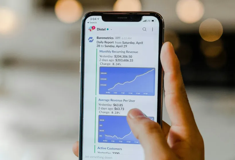
Website conversions are often misunderstood—especially in SaaS. They don't always mean purchases. They can include trial signups, demo requests, or even email subscriptions.
Clear messaging plays a key role in helping visitors understand what a product does, who it's for, and why it matters—quickly. This matters most on high-intent pages like home, pricing, and product.
What are SaaS website conversions
SaaS website conversions are actions taken by visitors that move them closer to becoming customers. These actions often include signing up for a free trial, requesting a demo, starting a subscription, or booking a sales call.
Instead of focusing only on traffic volume, SaaS teams usually focus on how many of those visitors take one of these steps. That's because conversions signal intent and create a direct path to revenue.
For many SaaS companies, the average website conversion rate falls between 2% and 5%. Some companies with strong product-market fit or low-friction onboarding report rates above 10%, but those are the exception.
In a typical SaaS conversion funnel, a visitor first lands on the site and reads the homepage or product page. If the messaging is clear and the user sees value, they might click a call-to-action button that leads to a sign-up or demo form. Completing that form is the conversion event.
Why clear messaging drives conversions
Clear messaging increases SaaS website conversions by helping visitors understand the product, who it is for, and what action to take. When visitors can quickly identify value and next steps, they are more likely to convert.
This process works because the human brain prefers clarity. When website messaging is simple and direct, it reduces cognitive load—the amount of mental effort needed to understand something. Lower cognitive load makes it easier for users to make decisions without confusion or hesitation.
Benefits of clear messaging include:
- Reduced bounce rates: Visitors are more likely to stay when they immediately understand whether the product applies to them
- Faster decision-making: Clear benefits and outcomes help users move through the funnel without delay
- Higher quality leads: Targeted, specific language attracts users who are aligned with the product's purpose
- Improved trust: Transparent and direct communication builds credibility with potential customers
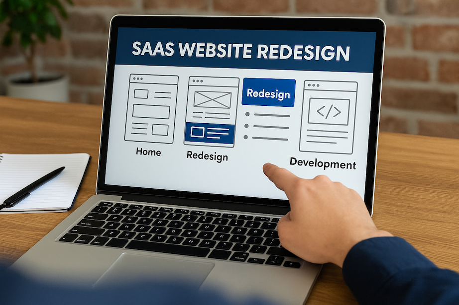
Key steps to optimize clarity on critical pages
Messaging optimization can target many areas of a website, but the most effective place to start is with high-impact pages. These often include the homepage, pricing page, product overview, and sign-up forms.
The table below shows examples of website elements before and after clarity-focused optimization:
Website ElementBefore OptimizationAfter OptimizationHomepage Headline"Reimagine Collaboration""Get Your Team Aligned in 7 Days—No Meetings"Navigation Label"SolutionsX""Product"Sign-Up Form9 fields including job role4 fields: Name, Email, Company, PasswordCTA Button Text"Learn More""Start Free Trial"
1. Simplify the homepage headline
The "5-second rule" states that a visitor should be able to understand what the product does and who it helps within five seconds of landing on the page. This helps users make a decision about whether to continue exploring the page.
A basic formula for writing clear homepage headlines is:
[Outcome] + [Timeframe] + [Objection Handled]
Examples of headline rewrites:
- Before: "Smarter Hiring Starts Here"
After: "Hire Pre-Vetted Engineers in 3 Days—No Recruiters Needed" - Before: "Your Data, Reimagined"
After: "Turn Customer Data Into Growth Insights in One Dashboard"
Testing headline variations can involve A/B testing tools like Google Optimize or VWO. Test one variable at a time (such as the outcome or the timeframe) and let the test run until a statistically significant number of users have seen both versions.
2. Streamline navigation
Complex navigation increases decision fatigue. When users are presented with too many options, they may leave the site or overlook key pages.
Navigation menus with 5–7 primary items are common. More than that can overwhelm users. Clear labeling is easier to process than clever or branded terms.
Best practices for navigation:
- Use conventional naming (e.g., "Product," "Pricing," "Resources")
- Place top-converting pages (like "Demo" or "Sign Up") in prominent positions
- Include a clear CTA in the main navigation (e.g., "Start Free Trial")
- Use progressive disclosure to reveal complexity only when needed
3. Reduce form fields
There is a known correlation between the number of form fields and conversion rates. Fewer fields generally increase the likelihood of form completion.
Recommended number of fields:
- Free trial or demo sign-up: 3–5 fields
- Contact or lead capture: 4–6 fields
- Enterprise request: 6–8 fields (with optional fields where possible)
Smart forms can use conditional logic to show or hide fields based on user input. This keeps forms short for most users while still collecting needed information.
4. Use social proof strategically
Social proof supports clarity by showing that other users and companies have benefited from the product. This can help validate claims made in the messaging and reduce uncertainty.
Common types of social proof for SaaS websites include:
- Testimonials from customers
- Case studies with measurable outcomes
- Recognizable client logos
- Usage metrics (e.g., "Used by 10,000+ teams")
Placement guidance:
Place testimonials near feature descriptions or CTAs to reinforce the message. Include logos near the top of the homepage to establish credibility quickly. Use metrics near pricing or sign-up sections to reduce perceived risk.
5. Implement A/B testing on key copy
Testing is used to identify which version of a message performs better. A/B testing presents two variations to different users and measures the outcome.
A simple testing process:
- Identify an element to test (e.g., a headline)
- Create a variation with one change
- Run the test until both versions have enough data
- Measure performance using a defined metric (e.g., form submissions)
High-impact elements to test:
- Homepage headlines
- CTA button text
- Value proposition statements
- Feature descriptions
How to measure and track improvement
To understand if messaging changes are helping a SaaS website convert more visitors, it is important to track more than just the conversion rate. Other useful metrics include time on page, bounce rate, scroll depth, and click-through rate.
Time on page measures how long a visitor stays on a page. Bounce rate shows the percentage of visitors who leave the site after viewing only one page. Scroll depth tracks how far down the page someone scrolls. Click-through rate measures how often users click on a specific link or button.
Here is a basic framework for tracking each metric:
MetricGoalWhat It IndicatesConversion Rate2–5% or higherVisitors completing a desired actionTime on Page45–90 seconds per pageUser engagement and content readabilityBounce RateUnder 50%Message clarity and page relevanceClick-Through Rate1–3%+ on CTAsStrength of message and call-to-action
To collect and review this data, specific tools are commonly used. Google Analytics can track conversion rate, bounce rate, time on page, and click-throughs. Tools like Hotjar offer heatmaps and session recordings, which help visualize user behavior.
Common mistakes that sabotage clarity
SaaS websites often lose clarity through vague or overly complex language. This creates confusion for visitors who are trying to understand what the product does and who it is for.
One frequent issue is jargon. Phrases like "leverage synergies" or "scale mission-critical workflows" do not clearly describe actions or outcomes. Another issue is excessive abstraction. For example, a headline like "Transform the way you work" does not explain what is being transformed or how.
Complex sentence structures can further distort meaning. Long, multi-clause sentences with layered modifiers may appear impressive but often obscure the main point.
Common examples of unclear messaging:
- Jargon: "Enable cross-functional alignment at scale"
- Vague claims: "The most advanced platform ever built"
- Overused phrases: "Revolutionize your workflow"
- Unclear calls to action: "Explore possibilities"
A basic checklist can help identify unclear messaging:
- Does the headline explain the product's outcome in 10 words or fewer?
- Does each section answer a specific question a visitor might have?
- Are all technical terms explained or linked to documentation?
- Can someone unfamiliar with the product summarize the value after reading?
Turn your website into a growth asset
Clear messaging helps SaaS websites guide visitors through key decisions. It relies on removing ambiguity, using precise language, and making the product's value easy to understand. When done well, it supports faster decisions, higher engagement, and more consistent conversions.
To apply clear messaging, focus on the highest-impact areas first. These are the pages and elements most likely to influence a visitor's next step—especially on the homepage, pricing, and product pages.
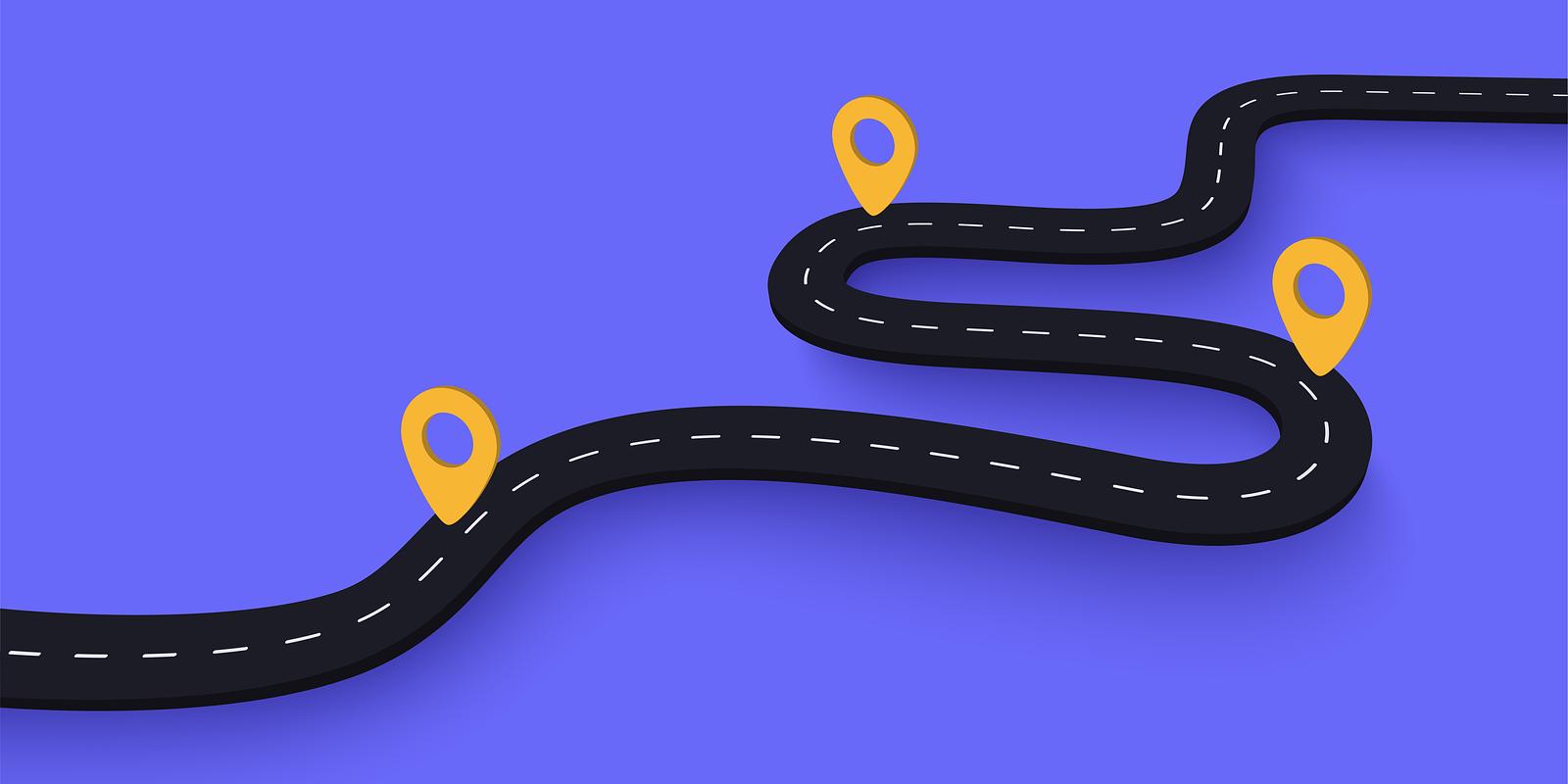
Here is a basic roadmap:
- Start with your homepage headline. Ensure it communicates what the product does, for whom, and what outcome it delivers.
- Review your navigation structure. Limit it to 5–7 items and label sections with familiar terms.
- Simplify your sign-up or demo request forms. Reduce the number of required fields.
- Add specific social proof. Use testimonials, case studies, or customer logos near CTAs.
- Run controlled A/B tests on messaging elements such as headlines and CTA buttons.
Clear messaging is not a one-time task. It works best when reviewed regularly with user data, feedback, and testing. Market conditions, product features, and audience expectations evolve over time, and messaging must reflect those changes.
Ready to transform your website into a conversion machine? Get your free homepage wireframe at https://calendly.com/ed-maxperformance/discovery-call.
Frequently asked questions about SaaS website conversions
How do I adapt messaging for different SaaS buyer personas?
Start with one clear message about what the product does and who it helps. Then, adjust the supporting text to match each persona's specific problems, goals, or job roles.
What is a good conversion rate benchmark for SaaS websites?
Most SaaS websites convert between 2% and 5% of visitors into sign-ups, trials, or demos. Websites with strong alignment between product and audience sometimes convert at 10% or higher.
How quickly can I expect to see results after improving my messaging?
Most companies begin to see changes in conversion rates within two to four weeks of updating their messaging. The speed of results depends on traffic volume and testing methods.
Which messaging elements have the biggest impact on SaaS conversions?
Headlines, value propositions, and call-to-action (CTA) text affect conversions the most. These elements appear early on the page and guide user decisions.